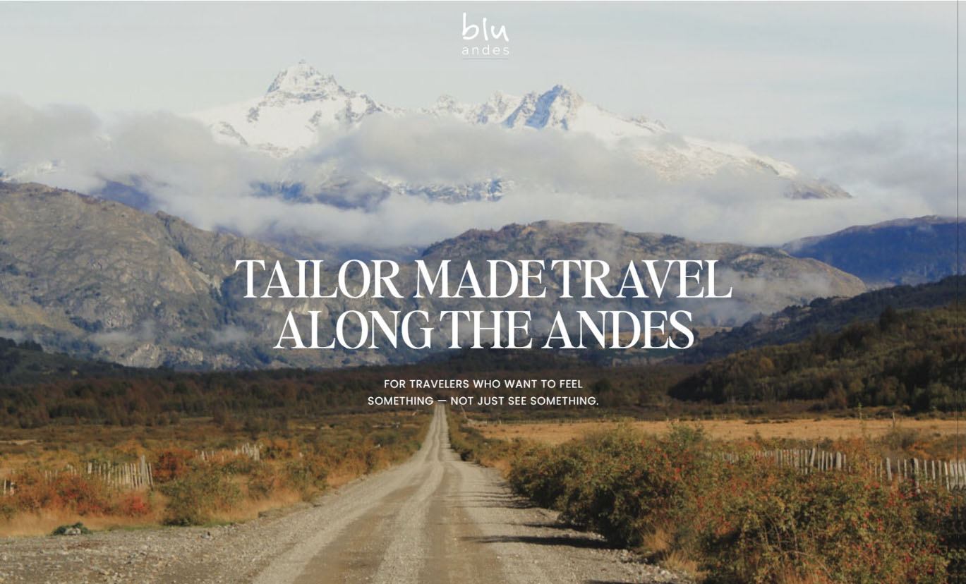
How a One Page Site Can Be Perfect for Your Service Business
There’s a weird thing that happens when you’re building a small, intentional business.
You know you’re doing good work. You know you’re offering something valuable. You pour your heart into your client experiences.
But when you look at your website? Eh. It doesn’t always feel like it matches the depth of what you’re offering.
That’s where An from Blu Andes found herself.
Table of Contents
A travel advisor with a one-of-a-kind offer (but a website that wasn’t saying so)
An is exceptionally good at what she does. She’s a travel advisor specializing in tailor-made trips to South America — not the packaged, touristy stuff. We’re talking about the kinds of journeys that connect you to the real heart of a place.
She’s been quietly building relationships, solving problems on the ground, and offering the kind of service that feels almost impossible to find these days.
She knew it was time to build something that matched the depth and quality of her service without overcomplicating it, over-spending, or trying to fit into the “big travel agency” box.
She wanted to stay small and nimble… personal, really. (Like the kind of travel advisor who remembers your favourite wine and re-routes your trip when the weather changes. Because that’s who she is.) And she needed a website that reflected that properly.
Building a One Page Site That Feels Like You
She didn’t need a giant website. She needed a right-sized one.
One of the best parts of this project was how clear An was from the beginning. She knew what she wanted:
✔️ A custom website design that felt calm, personal, and trustworthy
✔️ A one-page service-based business website that felt like an invitation, not a sales pitch
✔️ A space that reflected her. No clutter, no pop-ups, no bells and whistles just for show
👉 She wanted a website that matched the quiet excellence of her work.
So that’s what we built.

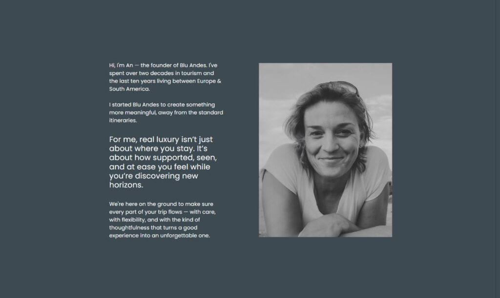
She also ended up including something that initially made her feel a little vulnerable: a photo of herself.
When you offer a service that’s this personal (when you’re literally shaping the experiences people will remember for the rest of their lives) putting a face to the name really matters.
It helps people feel safe. It helps them trust that there’s a real human on the other side who will take care of the details and solve problems as they pop up. (Because let’s be honest, travel plans always throw a curveball.)
For An, being able to share that image of herself (and feel good about it) was a small but meaningful step toward owning the incredible value she brings to her clients!
The Travel Advisor One Page Site We Created
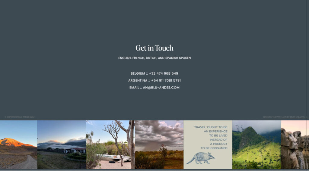
We built An a one-pager that’s calm, clean, and beautiful. It’s the kind of site that’s warm and inviting, with enough detail to show you why Blu Andes is special… without telling you every single little thing.
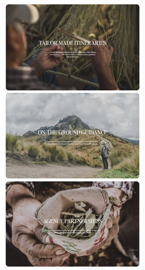
The site subtly weaves in her unique value:
➡️ Her deep local knowledge.
➡️ Her personal connections to exclusive places and people in Argentina, Bolivia, and Chile.
➡️ Her ability to pivot when travel plans shift; something she’s known for and something travelers deeply appreciate!
And here’s one of the details that I absolutely love:
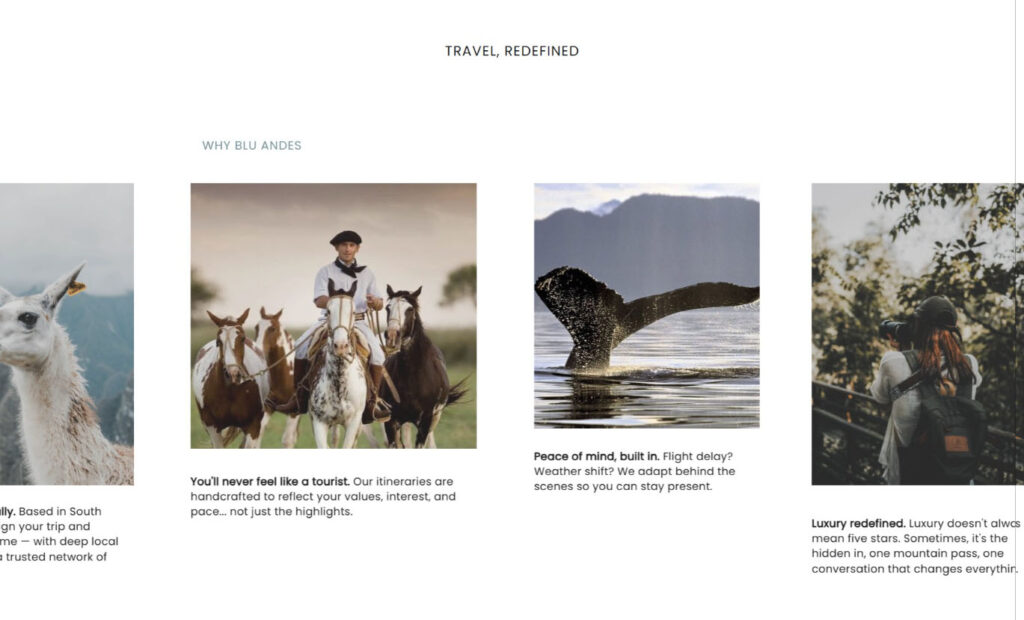
We added subtle animations throughout the site — soft, almost imperceptible movements in the photos. It’s the kind of thing you might not notice right away, but you’ll do a double take when you catch a llama blinking or a breeze shifting through the grass. DELICIOUS. I LOVE IT.
It gives the whole site a peaceful, living, breathing quality which couldn’t be more aligned with An’s work.
It speaks to the people who love comfort and quality, but who also know that the best stories usually come from the places that aren’t marked on a map.
It shows how An’s deep local knowledge, her personal network, and her flexible, on-the-ground support create trips that are both seamless and surprising.
It’s simple by design. And that simplicity leaves room for the right conversations to happen!
What Made This Custom One Page Site Design Work So Well
Working with An was an absolute delight. (If I could clone her, I would.) She was:
- Clear about her vision and her boundaries. She came in knowing what she wanted to invest, what she needed from her website, and what would actually serve her people. Zero guesswork. Zero drama.
- Open and thoughtful in her feedback. When something didn’t feel right, she spoke up. When she needed time to process, she took it. And when she provided feedback, it was always organized, specific, and incredibly helpful.
- Grounded in her purpose. An isn’t here to churn out trips. She deeply cares about the experience her clients have, not just on their adventures, but from the very first interaction. She wanted to get it right. And she did.
When we launched the site, her very first feedback was simple and heartfelt: “Wooooow… it definitely looks great!”
That’s the kind of email that makes our day!
When you work with people who truly care — about their work, their clients, and their partnerships — it’s easy to create something beautiful together.
More Than “Just” a One Page Site
It’s not just that it’s pretty (although it is). It’s that it’s strategically simple.
A one page site can absolutely do heavy lifting when it’s built well! It can create a professional, welcoming first impression. It can offer clarity. It can build trust. And it can gently guide the right people to reach out.
There’s something to be said for building what you need, not what you’re “supposed” to have.
You don’t always need the content monster. You don’t need 15 tabs. You don’t need to climb the SEO mountain with nothing but a broken backpack and sheer willpower.
You need a site that:
- Makes people feel safe
- Builds instant trust
- Clearly shows how you can help
- Feels like YOU
That’s exactly what we built for An — and we’re so excited to see it grow alongside her!
Big Wins From This Travel Advisor One Page Site Design
💥 Personal connection front and center.
An’s photo isn’t just a nice touch, it’s a trust-builder. When you’re hiring a travel advisor (or any service provider, really), you want to know who’s on the other side of your emails. You want to see the human who’s going to remember your name and actually care when things go sideways.
💥 Custom, not cookie-cutter.
We built a unique, custom one page site design that mirrors the way An works: calm, thoughtful, and quietly impressive.
💥 Focused on service.
We highlighted her key offerings: tailor-made itineraries, on-the-ground support, and local connections. No extra fluff.
💥 A seamless, stress-free experience.
(That’s our thing.) We’re here to make this website process as easy and delightful as possible, not another thing to babysit!
Thinking About Your Own Website?
If your website feels like it belongs to the version of your business you left behind (read: too big, too clunky, or just not quite right) you don’t have to wait for “someday” to fix it.
Whether you’re a travel advisor, therapist, photographer, or any other service provider, we can help you build something custom, simple, and beautifully you.
TL;DR
An’s new travel advisor website design is:
- A custom one page site
- Beautiful, simple, and trust-building
- Designed to attract perfect-fit clients who value her personal touch
You don’t need a giant site. You need the right site.
📩 Ready for a website that feels like you? Start here!
