How We Helped a Financial Service Provider Build a Brand That Actually Fits
There’s something funny that happens in business.
You outgrow your old branding wayyyy before you’re ready to admit it.
At first, you can kind of feel it. Like when your favourite jeans still technically fit, but you know in your heart they’ve seen better days. They’ve stretched out in weird places. The button’s hanging on for dear life. (Wait, is that just me? 🤣 WHY DO I WAIT FIVE HUNDRED YEARS BEFORE REPLACING THE OL’ SAGGY BAGGIES*)
*I could turn that into a whole analogy about how you, too, wait for five hundred years before replacing your’ saggy baggy website… but I’ll refrain.
Anyways, that’s where Kylie was earlier this year.
Table of Contents
Here’s a peek at her original financial service provider website. It had a unique look, but it was ready for its next chapter.
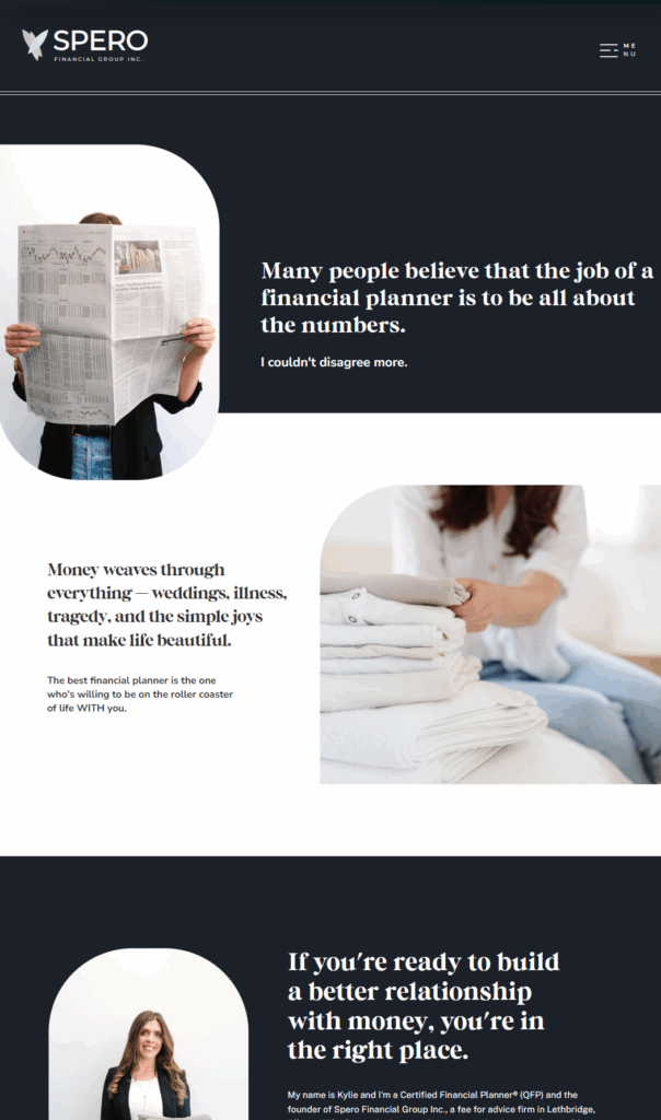
When we first worked together, we built a custom website for a financial service provider that did its job and proudly stood out from the sea of cookie-cutter finance brands. It was warm. It was welcoming. It was perfectly different in all the right ways. She got tons of compliments and “wait, what? How did you… that’s… wow!” from folks who were used to the tired, stuffy finance industry.
But even then, a lot can change in a year.
Kylie’s grown — and so has her business. (Honestly, we’re super proud of how far she’s come. It’s been SO FUN to work alongside her on this journey!)
She’s gotten crystal clear on who she’s here to serve, how she serves them, and what actually makes her work so life-giving for her clients. And with that clarity came the nudge that her website needed to “grow up” with her financial services brand.
Website Redesign Tips for Service-Based Businesses in the Finance Industry
This is one of those situations that we see all the time.
The first version of a website can absolutely work. It can look great, feel aligned, and get results, but it’s often just the beginning. Especially for financial service providers who are refining their message, evolving their offers, and stepping into a more seasoned version of themselves.
For me? EVERY SINGLE ITERATION of my website is “the best work I’ve ever done and I’ll never have to change this ever ever for real this time” and guess what… six months later, we’re freshening it up again. And I wouldn’t have it any other way. Your website should grow and evolve alongside you!
PS: That’s why we build on Showit, and that’s why you get FULL access AND a personalized website manual showing you exactly how to make updates on your own when you work with us. Keeping it fresh should be EASY.
Sorry, I’m getting distracted. Back to Kylie.
She didn’t hate her old website. She loved it.
But she needed a grown-up version. One that was more polished, more refined, and more “her” than ever.
Take a look at how we laid out Kylie’s services in a clear, uncluttered way.
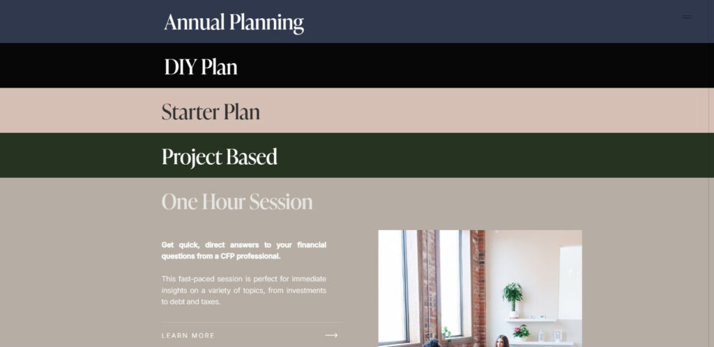
We helped her:
- Showcase her unique expertise in a more confident way
- Present her (many!) offers clearly, without overwhelming her audience
- Elevate her visual identity to match the level of excellence she brings to her work
And let me tell you: the new branding for a financial service provider blazes with what’s special about her.
The #1 Website Mistake Financial Service Providers Make (and How to Fix It)
If we could pass one gold-plated, neon-lit piece of advice to anyone reading this it would be this:
👉 When everything is important, nothing is important.
(We say this a lot around here. Usually while waving our arms and trying not to fall off of our chairs. OKAY FINE THAT’S JUST ME… all of my staff is much more dignified. But they believe it too, to their core. They’ll just send you this bird meme when you request too many add-ins: “wut.” Yes, it’s a real thing, and no, we are not above bird memes in this house.)

One of the challenges we ran into with Kylie’s project was the temptation to pack everything into the site. Every service, every option, every helpful tidbit.
And listen, we get it. When you care deeply about what you do, you want your people to have all the information.
But here’s the thing: Clarity sells. Complexity stalls.
We’ve built this business on the belief that you don’t need to say everything. You just need to say the right things, at the right time, in the right way.
Those evergreen, always-important tidbits? Maybe on your site. But remember! You’ll also get a chance to have real, human conversations with people who inquire, and you can share your magic there too!
Your website’s job is to get them to say two things:
- “I get what you do”
- “YOU are the person I need to hire.”
That’s it.
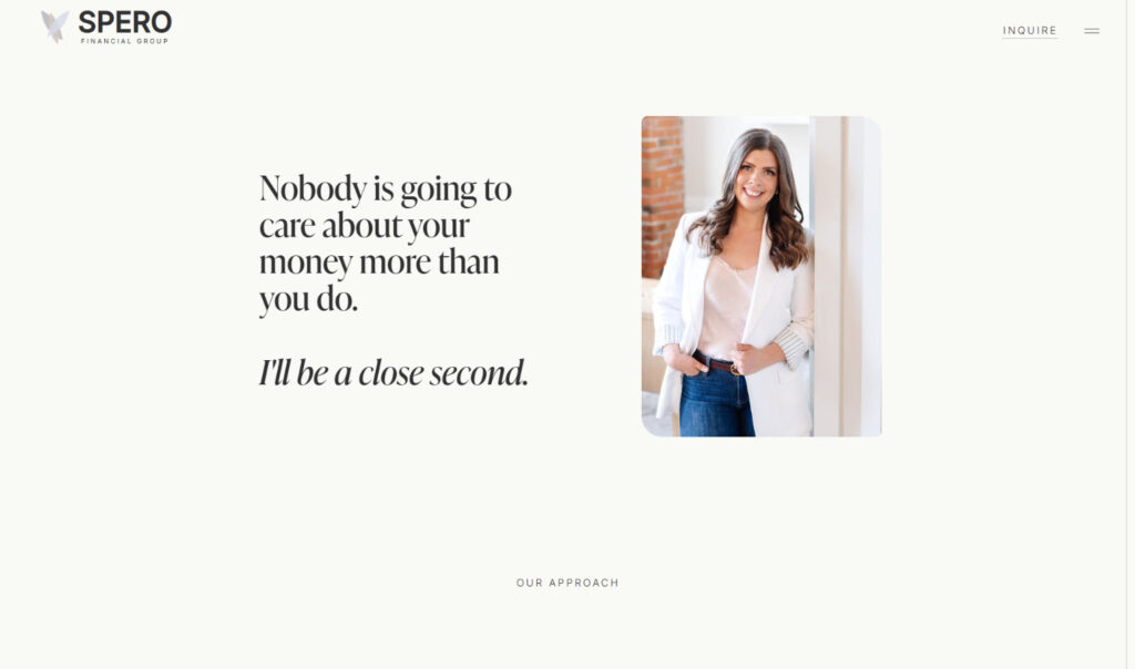
Here’s a great example of messaging that feels both personal and powerful, the kind of thing you can only say when you’re confident in who you are and who you serve.
If you fire-hose them with information, they’ll get overwhelmed and move on to the next option.
The most sales don’t go to the person who’s the most talented.
They go to the person who’s the most clear about the transformation they offer.
Your financial services site doesn’t need to say everything. It needs to say the right things.
The heavy lifting happens when your website is clear, focused, and easy to navigate. Not when it’s jam-packed with every possible detail.
You’ve likely got other places to share the rest of your story:
- Real conversations
- Email marketing
- Social media
Your website’s job is to get them to the “I’m in” moment. The rest can unfold over time. Does that make sense?
That’s where we come in. To help financial service providers and other service-based businesses get laser sharp on what your people actually need to know. To design websites that breathe, guide, and convert — not sites that make you feel like you’re wandering the digital equivalent of a Costco on a Saturday afternoon. (Overwhelming. Packed. Slightly sticky. And probably someone’s kid screaming nearby.)
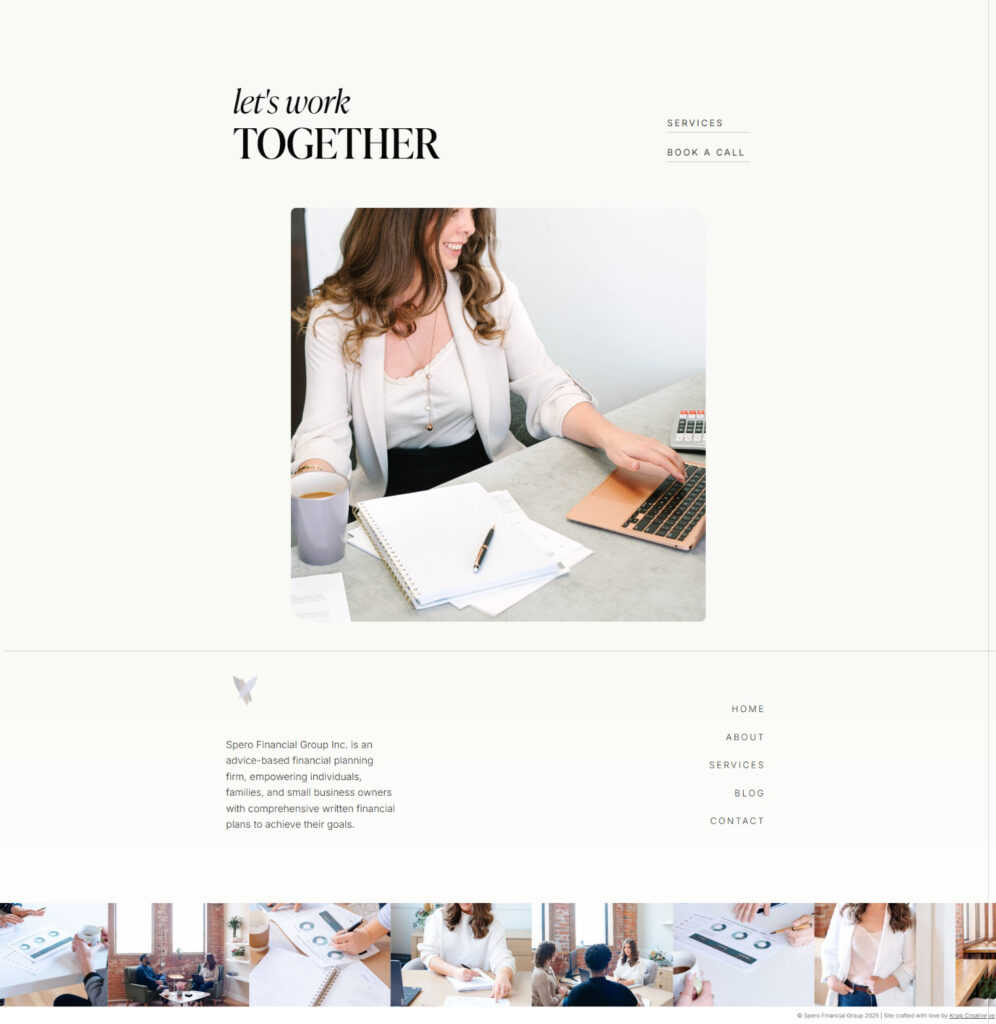
With Kylie, we presented a streamlined, spacious version of her site that made her offers shine.
The entire site gently guides visitors toward the next step, without overwhelm.
Of course, like many entrepreneurs, she had a few last-minute additions (don’t we all?!) but we’ll always advocate for a clear, focused experience over a laundry list of services.
That’s part of the Knap promise — we’ll push back when we need to. We’re here to make you look good, and sometimes that means helping you say less, better.
Custom Website Design for Service Providers: Final Thoughts
Your brand isn’t a one-and-done thing. It grows with you.
And sometimes, what you need isn’t a complete overhaul, it’s a thoughtful evolution.
That’s exactly what we created with Kylie at Spero Financial Group. A financial services website that feels like home. A brand that feels like her. And a clear path for her perfect-fit clients to say yes.
If your brand is starting to feel a little tight around the waistband, let’s talk.
We’re booking custom website design for financial service providers and other service-based businesses now and we’d love to help you build a beautiful website that fits exactly where you are.