Case Study: Showit Website Design for Massage Therapist
When Kim from WG Massage approached us about revamping her website for her massage therapy business, it was an instant YES. From our very first Zoom call with her, it was clear she’d be a perfect fit.
Why? Well, for starters:
- Genuinely cares about her clients’ experience? Check.
- Amazing at giving massages? Yep, that’s Kim!
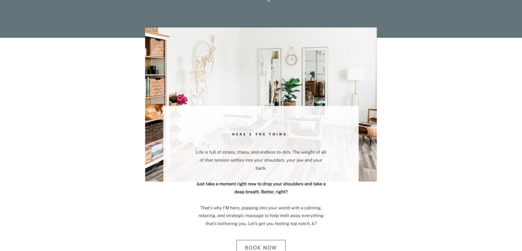
- Pays attention to every detail of her physical space and wanted to bring that cozy vibe into the digital world? You got it!
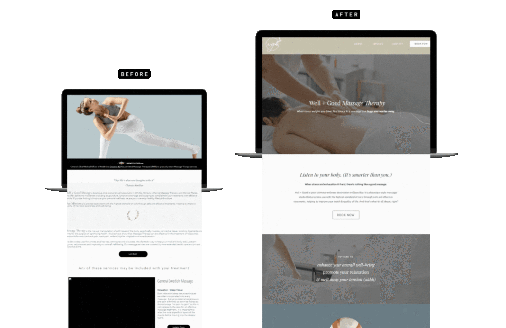
Table of Contents
Showit Website Design: The Backstory
When Kim approached us, she was ready to throw in the towel with another website designer who hadn’t delivered anything even close to what she was looking for. She was frustrated, and she knew she wanted something world-class, but what she was getting was nowhere near that level. (Frankly, what she had was something she could’ve cobbled together on her own.)
Investing in a custom website is a big deal, so when you get a crappy experience, it’s a major letdown.
Knowing she’d already thrown some dollar bills out of the window, we started fresh, using one of our favorite basic templates, and customized it to fit her massage business perfectly.
I’m thrilled we connected, and she took the plunge with Knap Creative – and she feels the same way!
In her words:
Subj: First Proof | “OMG… I’m working between clients, but I friggin’ (cape bretonese) love it! Like I seriously LOVE IT!!”
Showit Website Design :: Goals & Deliverables
Every website project begins with a strategic kickoff session. We dove deep – learning everything about Kim, who she wants to work with, how long she’s been in the game (six years!), and what makes her truly special. (Besides her second-to-none massages, obviously.)
We also pinpointed why potential clients might hesitate to work with her and the hurdles they faced in finding her.
Here was our to-do list following the first call:
- Make Kim’s digital space feel just as cozy, relaxed, and inviting as her massage studio
- Detail her services, without getting too jargony
- Ensure that it’s super easy for Kim’s clients to book or rebook with her using an online booking form
- Integrate appointment scheduling software for a seamless booking experience
Our styles mesh perfectly, so this was a breeze!
Showit Website Design :: Our Favourite Parts
- The website’s simplicity and clarity. It’s the most effective way for Kim (or you!) to get her message across. It’s fresh and spacious, just like Kim’s stunning space.
- The homepage copy promising to “hug your worries away.” Every chat with Kim feels like a giant hug, so this is 1000 percent on brand.
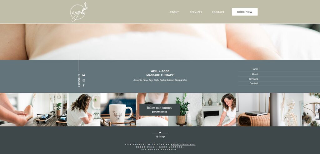
- The professional brand photos. Kim found a photographer with style, and the results are stunning. Brand photos add that professional touch – totally worth it.
Showit Website Launch: The Results
Kim’s website now perfectly mirrors her beautiful studio and captures the essence of what it’s like to work with her.
And the cherry on top? Kim’s stuck around for more — we’ve created several rounds of social content for her too. A repeat customer says it all.
(Oh, that’s right — we can help you with more than just your website! Our Instagram Intensives are a perfect, low-commitment, budget friendly way to try us out for your social media content. Get more info right here.)
In Kim’s words: “Heyyyy…..have I mentioned that I love EVERY SINGLE thing about the work you all did? I’m gonna tell you again anyway. :) I LOVE LOVE LOVE my posts and website!”
Thanks, Kim! We love working with you!
Want this to be you too? We thought you’d never ask! 😉 Check out all the details on our Website Design Services here, or book a discovery call right here. Can’t wait to chat!

