4 ways to list prices on your website: a guide
Recently, I spent a fun hour getting attached to a potential new client on a discovery call. She’s smart as a whip, talented as heck, and needs a website. Perfect, right?
Well, it was perfect… till we came to the budget part of the conversation.
She was looking for something HALF the price of our usual starting point for a website design.
That blows. I was genuinely excited to work with her.
Lesson learned: By clearly communicating your prices from the outset, you can attract clients who are ready to invest and avoid wasting time on conversations that aren’t going anywhere.
It’s tough to put a dollar value on something that you love-love-love doing. If you’re anything like me, you want to do it for like, $5. Or maybe your clients could let you pay THEM to tackle those fun projects, amiright?
In this blog post, we’ll share strategies for presenting your prices in a way that is both clear and persuasive. By following these tips, you can position your services as valuable and attract the right clients for your business.

Table of Contents
Pricing psychology: how to make your prices look great
We all know that pricing is about wayyy more than just the numbers. It’s about how we humans think about money, and there’s a whole science to it.
Here are some tried-and-true tactics you can use:
- Odd vs. Even: Odd numbers ($99 instead of $100) make things seem like a bargain. It’s like our brains are wired for deals.
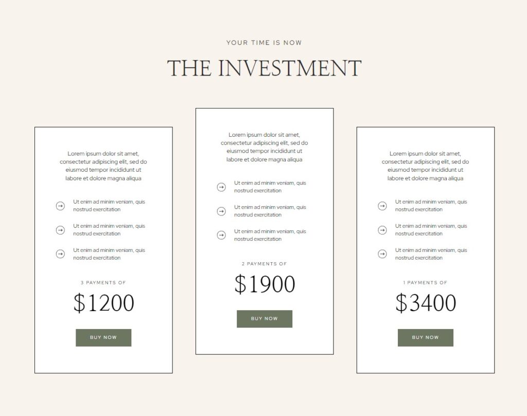
- Anchoring: If you show someone a super expensive option first, even if they don’t buy it, the cheaper options look way more reasonable. (See it in action! Example below. Here’s another great one from one of our templates!)
- Prestige Pricing: Sometimes, making things more expensive can make them seem more exclusive and desirable. It’s the whole “you get what you pay for” thing.
So, next time you’re setting your prices, don’t just think about the numbers. Think about how those numbers will make your clients feel. Focus on the value your services provide and how they can benefit your clients’ businesses.
WHERE to list your prices on your website
Price list on services page
Create a price list on your services page. Just a list or table with your services & pricing is great! If you want to add short descriptions, even better.
Pros:
- Easy to find & understand for potential clients
- Can be visually appealing and professional
- Super simple to update if / when your pricing changes
Cons:
- Might not be great for your biz if you’ve got a complex pricing structure or a lot of different offers
Best for:
- Businesses with a limited number of offerings, such as a freelance writer who offers three main packages: blog posts, articles, and whitepapers.
If you like the idea but you’re debating whether you need to scrap your services page and start fresh, don’t dive in till you’ve read this! 3 Signs It’s Time to Get a Website Redesign
Behind an email signup
If you’re using an email marketing platform like Flodesk or ConvertKit, consider creating a gated pricing guide. This involves setting up a form that redirects potential clients to your pricing page once they submit their email.
To implement this:
- Create a new form in your email marketing platform.
- Adjust the settings to redirect users to your pricing page upon form submission.
- Add a call to action on your services page, such as “Enter your email to access the pricing guide.”
- Embed the form below the call to action.
We adore this method because
- It weeds out the people who don’t really want to work with you. If someone can’t put their email in a form, they likely aren’t actually serious.
- You can see exactly who is looking at your pricing page in real time and potentially follow up, if you choose to!
Pros:
- Gives you a way to follow up even if your leads don’t convert right away
- Helps you build trust with potential clients
- You can send over a PDF guide that includes tips for choosing the best (whatever you do), a breakdown of your process, or any other information that’ll help your clients choose you!
Cons:
- If they download the guide in, say, March, and you update your pricing in October, there’s no way for you to update it
- More effort to set up
Best for:
- Businesses that want to offer additional value to potential clients and generate leads. If you want to learn more about nurturing those relationships with email, read up right here! 5 Ways to Get More Website Leads — And CONVERSIONS
Inside a contact form
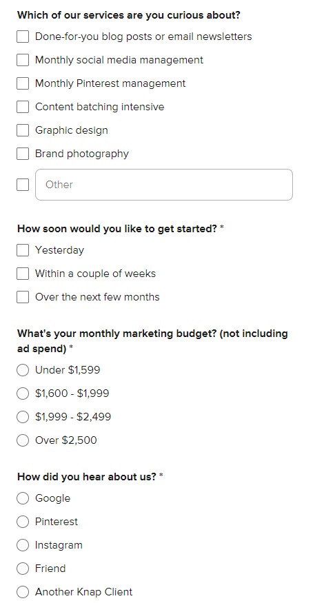
Include a “budget” field inside your contact form, allowing potential clients to let you know their price range. You can ask for info like project goals, timeline, etc here as well!
Pros:
- Gives the client a heads-up about where you’re at before the call
Cons:
- Kind of a hassle to get to for your clients. Clear is kind!
Best for:
- Businesses that offer custom pricing or want to gather more information from potential clients before providing a quote.
IG highlights
Create a dedicated highlight called “pricing” and add some short clips that showcase your pricing info.
Pros:
- Super easy to update
- People are likely checkng out yoru socials before hiring you
- Can be visually appealing & engaging
Cons:
- As a standalone, it’s not enough
Best for:
- Businesses with a strong Instagram presence and simple pricing structures. For example, a social media management agency could create a highlight with a series of cards that list their different packages and prices.

HOW to list the prices on your website
Straight up
- Just say it: “Our hourly rate is $100, or you can choose one of our pre-packaged services starting at $500.”
- Best for: Simple, straightforward services like freelance writing or graphic design.
Starting at
- Give a range: “We offer custom web design packages starting at $1500.”
- Best for: Projects where the final price depends on the scope of work, such as website development or marketing campaigns.
Range
- Set boundaries: “Our pricing for social media management services ranges from $500 to $1000 per month.”
- Best for: Flexible pricing with a clear minimum and maximum.
Average Spend
- Give a ballpark: “The average client spends around $800 on our branding services.”
- Best for: Helping clients understand typical costs and avoid surprises.
Remember:
- Clear is kind: Make your pricing easy to understand and avoid jargon. Don’t hide your pricing. Let clients know up front what they can expect to pay.
- Be confident: Don’t apologize for your rates. Your expertise is worth it! Explain why your services are worth the investment and how they can benefit your clients.
- Consider a payment plan: If your services are expensive, offering a payment plan can make them more accessible to clients.
tl;dr
By presenting your prices clearly and persuasively, you can build trust with potential clients and attract those who are genuinely interested in your services. Remember to focus on the value your offerings provide and avoid hiding your pricing information.
Plus, imagine how much time you’ll save by not hopping on a call with those clients who can only pay you $8 for three weeks of work! Amazing. 😂
- Use odd numbers, anchor your packages with other options, and if you want to really showcase the value of what you’re doing — don’t be scared of a bougie price. (Bougie branding goes a LONNNNNGGGG ways when it comes to credibility. Don’t hesitate to reach out if you want some help there!)
- You can list your prices anywhere… services page, behind an email signup, even inside your contact form.
- And even if you’ve got custom pricing, we still encourage you to share a “starting at $XX” or “Range: $XX – $XXX” somewhere on your site. Clear is kind!
If you’re looking for a web designer to help you map out the best solution for you, we’d be delighted to help. Check out our pricing page to figure out what package might be best for you… and since you read this far, we won’t even make you sign up for my email list to get there! 😉 We currently have a clever little button with a popout for the pricing details, so if you want ONE MORE IDEA, there you go. YAWELCOME!


